The Y2K Comeback: Why Retro UI Is Trending Again
Introduction: Why the Digital World Misses the Past
Nostalgia in digital product design is no longer just a soft spot for bygone eras. Today it functions as a deliberate UX strategy. Familiar visual metaphors, tactile surfaces, and retro typography lower the mental barrier to entry. Users find products easier to navigate when they tap into a subconscious sense of familiarity.
After years of hyper-polished interfaces and rigid design systems, digital UI is pulling a sharp turn back toward skeuomorphism, raised buttons, pixel art, and the raw visual energy of the turn of the millennium.
Why are modern interfaces intentionally aging themselves? Is this a pushback against banner blindness in an era of copy-paste frameworks, a rebellion against lifeless minimalism, or calculated emotional marketing? Let us break down how retro patterns are reclaiming our screens.
What Is Driving the Retro Revival in UI?
The resurgence of vintage trends isn’t just a passing mood among art directors. It is a systemic reaction to how our relationship with technology has evolved.
1. Minimalist Burnout & Digital Fatigue
The past decade pushed digital design toward extreme simplification through flat elements, identical sans-serifs, muted palettes, and standardized design systems. While this made building products faster, it also stripped them of their personality. Overwhelmed by constant digital noise, users are tired of sterile, clinical screens. Textures, gradients, depth, and tangible metaphors bring back a sense of humanity and warmth, serving as a direct counterweight to endless white space.
2. Seeking Comfort in Predictable Eras
From vinyl sales and film cameras to endless movie reboots, nostalgia has swept broader culture. In uncertain times, the past feels safe and predictable. Interfaces are simply adapting to this shift. They borrow visual languages from simpler times to offer users emotional grounding and comfort.
3. Gen Z & Borrowed Nostalgia
While Millennials mourn the digital era of their youth, Gen Z frequently romanticizes a period they barely lived through. To younger generations, the 90s and Y2K represent an optimistic, naive, and visually expressive chapter of the early web. Modern UI does not need historical accuracy here. It just needs to capture the mood and recognizable symbols.
4. Emotional Differentiation for Brands
When most apps share nearly identical feature sets, visual identity becomes the ultimate differentiator. Retro elements help brands:
- Hook user attention instantly
- Increase visual recall and brand distinctiveness
- Signal authenticity, playfulness, and character
Ultimately, nostalgic UI isn’t about copy-pasting the past. It is an intentional modern remix. By wrapping modern, high-performance tech in warm, nostalgic aesthetics, designers create products that are both effortlessly functional and emotionally resonant.
The Y2K Phenomenon: How Turn-of-the-Century Aesthetics Took Over
Y2K is arguably the loudest retro movement in modern product design. It represents the visual language of the late 1990s and early 2000s, blending early web culture, rave aesthetics, sci-fi optimism, and a naive belief that technology was about to change everything for the better.
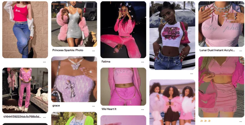
Anatomy of the Y2K Aesthetic:
[ High-Gloss & Chrome ]  •  [ Neon Accents ]  •  [ Organic "Blob" Shapes ]
[ Tactile Plastics ]     •  [ Display Fonts ]  •  [ Vibrant Gradients ]
Crucially, modern Y2K design does not try to clone early 2000s interfaces word for word. Nobody wants table-based layouts or broken Flash animations back. Instead, it pulls from the era’s cultural backdrop: CD covers, rave flyers, futuristic 3D renders, and early digital art.
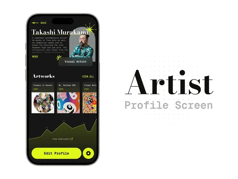
Real-World Application
Industry leaders like Spotify deploy Y2K cues surgically so they do not compromise core usability. They use them in interactive campaign microsites, personalized year-end reviews, high-impact landing pages for feature launches, and curated playlist artwork.
This approach highlights the core strength of Y2K in UI. It introduces personality and bold visuals without throwing usability out the window. Instead of forcing a total retro overhaul, designers use Y2K as an accent to enliven the product, highlight ties to pop culture, and make the overall user journey memorable.
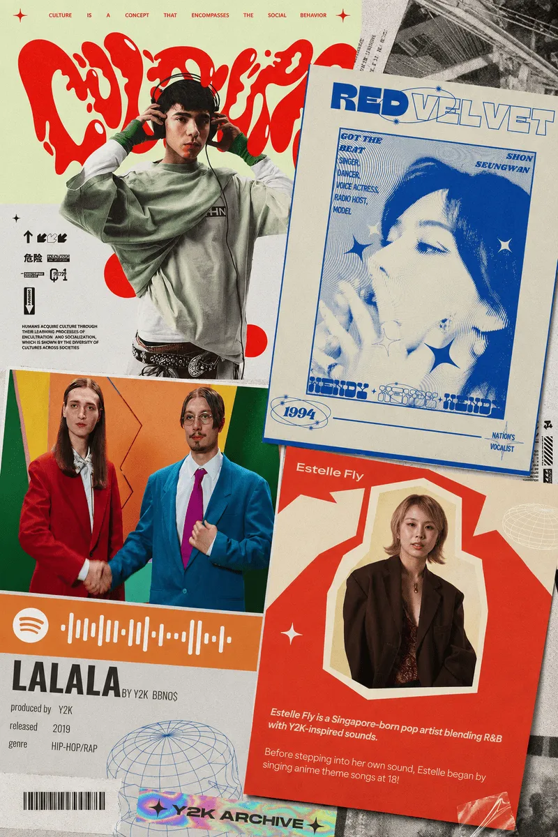
Retrofuturism: Reimagining Yesterday’s Tomorrow
The rise of retrofuturism stems from a distinct psychological shift. Modern technologies like artificial intelligence, pervasive automation, and silent algorithms are increasingly viewed with anxiety and a sense of lost control. Retrofuturism offers a refreshing detour. Here, technology is not a threat but an adventure, a discovery, and a promise of a brighter world. It revives the romance of progress that once accompanied scientific breakthroughs.
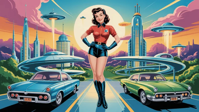
Digital products lean on this style precisely where they need to soften complexity or overcome user skepticism. You will see it most often in AI platforms, crypto projects, gaming, and experimental sites.
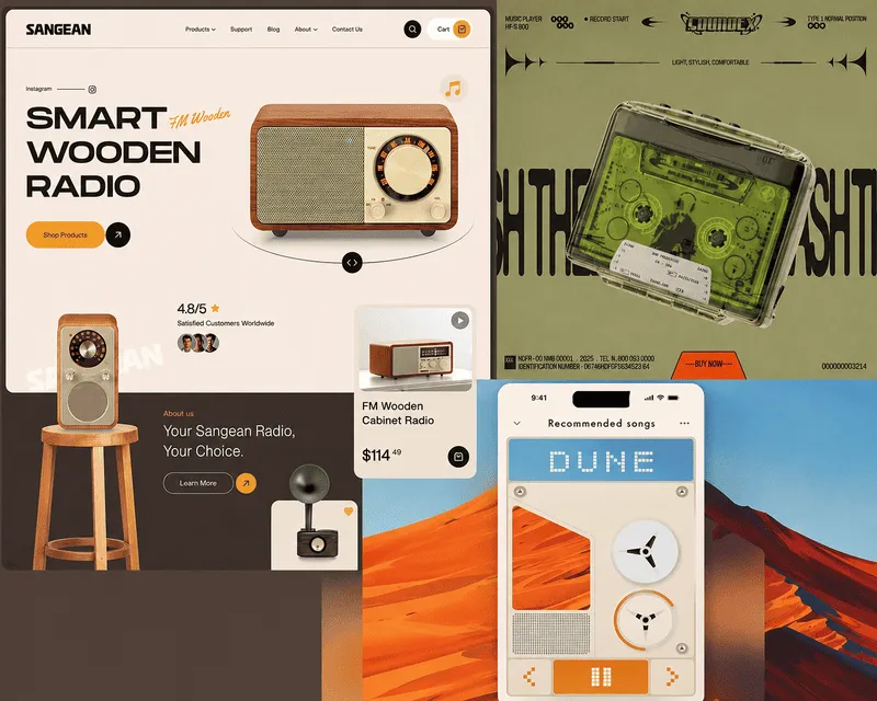
Sci-Fi Aesthetics (1960s to 1980s)
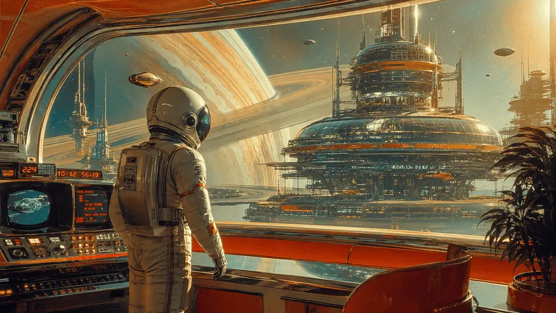
One of the most recognizable layers of retrofuturism is the vintage sci-fi look.
- Pseudo control panels and toggle switches
- Abstract data diagrams and glowing vector lines
- Oscillograms and scientific telemetry symbols
These decorative data elements rarely interfere with primary UI tasks. Instead, they live inside hero sections, onboardings, and illustrations, casting a sense of advanced systems without cluttering daily navigation.
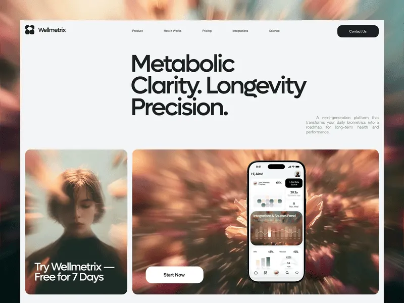
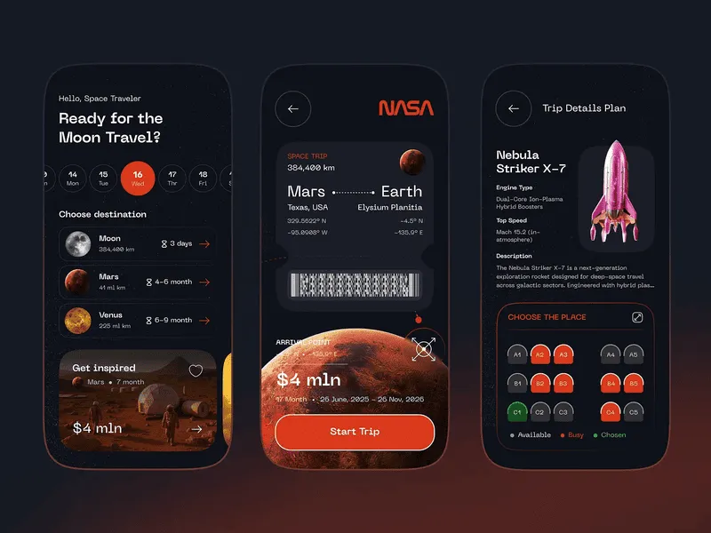
Vaporwave and Cyberspace Nostalgia
On the other side of retrofuturism lies vaporwave. Rooted in late 80s and 90s electronic music culture, vaporwave captures what the future used to look and sound like. Sunset gradients, wireframe horizon grids, primitive 3D renders, neon pinks, and purple palettes create an unmistakably moody tone. Yet vaporwave does not merely romanticize yesterday. It carries a layer of irony. Glossy geometric shapes sit beside vast empty spaces, echoing our complex love-hate relationship with technological progress.
Retrofuturism acts as an emotional layer in UI. It injects depth and grand ideas into a product without causing cognitive overload. It tells a story about a future that feels understandable, cinematic, and far less intimidating than reality.
Digital Brutalism: Honesty Over Polished Politeness
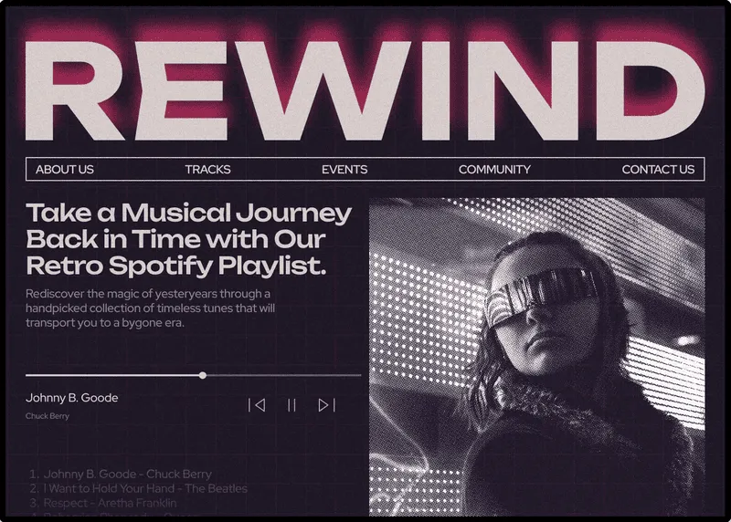
Digital brutalism is often misunderstood as intentionally broken or unnavigable design. That is a misunderstanding. Modern digital brutalism balances raw provocation with systematic order. It can feel abrasive and unpolished, or it can rely on a remarkably clear grid with razor-sharp readability. Its true goal is not chaos. It is a total rejection of corporate politeness and artificial smoothness.
From a nostalgic standpoint, brutalism is a clear retro phenomenon. It reaches back to Web 1.0 and the early 2000s, when websites were straightforward, technical, and unconcerned with hiding their mechanics. Buttons looked like native buttons, text looked like plain text, and page architecture sat right on the surface. Replicating this visual language today works as a nostalgic nod to a time when the internet was a functional tool rather than a hyper-optimized commercial product.
Visually, brutalism embraces unyielding techniques:
Brutalist Characteristics:
[ Monospaced Fonts ]   •  [ Stark High-Contrast ]  •  [ Limited Color Palettes ]
[ Oversized Headlines ] •  [ Raw Flat Elements ]    •  [ Visible Grid Lines ]
Because brutalist interfaces rely on strict logic, their information hierarchy is often easier to read than in classical minimalism. The structure simply does not hide behind soft drop shadows, rounded corners, or micro-interactions.
This explains why brutalism is favored by projects seeking an uncompromising voice. Creative agencies and design studios use it to showcase bold perspectives. Museums and cultural institutions adopt it as part of a curated statement. Municipal and public projects leverage it to highlight a non-commercial, authentic ethos. In these spaces, brutalism operates as a design manifesto that demands attention.
Skeuomorphism: The Return of Depth and Tactile Metaphors
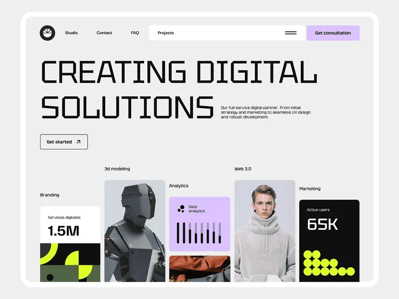
Skeuomorphism remains one of the most direct nostalgic styles in UI. It mirrors physical objects: buttons look pushable, surfaces display weight, and interface elements mimic real-world materials like leather, metal, and glass. For many users, this visual language instantly recalls early desktop applications and early mobile operating systems.
When flat design replaced skeuomorphism years ago, the change was celebrated as a move toward digital maturity. Yet as interfaces grew ultra-flat, they lost tactile feedback and emotional character.
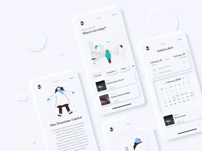
Today skeuomorphism is making a comeback in a refined form. Designers use subtle drop shadows, layered depth, glassmorphism, and soft volume. Rather than copying real objects directly, modern UI uses subtle physical cues that make digital environments feel tangible again.
This comeback is driven as much by usability as by aesthetics. Depth and physical cues lower cognitive load, especially across complex or feature-dense screens. Users grasp clickable targets and visual relationships much faster. In an age of complex software, soft skeuomorphism acts as an anchor that restores clarity and user confidence.
The Early Web: Embracing the DIY Internet
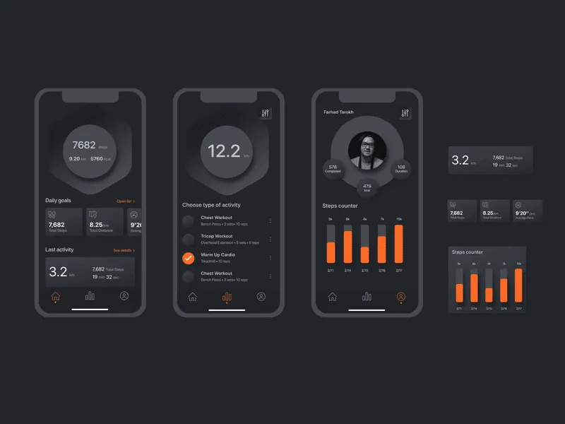
The early web aesthetic reflects nostalgia for an internet that existed before algorithms, endless feeds, and homogenized design systems. HTML tables, system fonts, raw primary colors, and exposed structures bring us back to Web 1.0, when websites felt like personal tools rather than conversion funnels.
Indie projects, personal portfolios, niche brands, and cultural initiatives frequently adopt this language today. The look immediately communicates a non-corporate identity, highlighting independence and a DIY approach. The interface ceases to be an invisible container and instead announces that a human creator stands behind it.
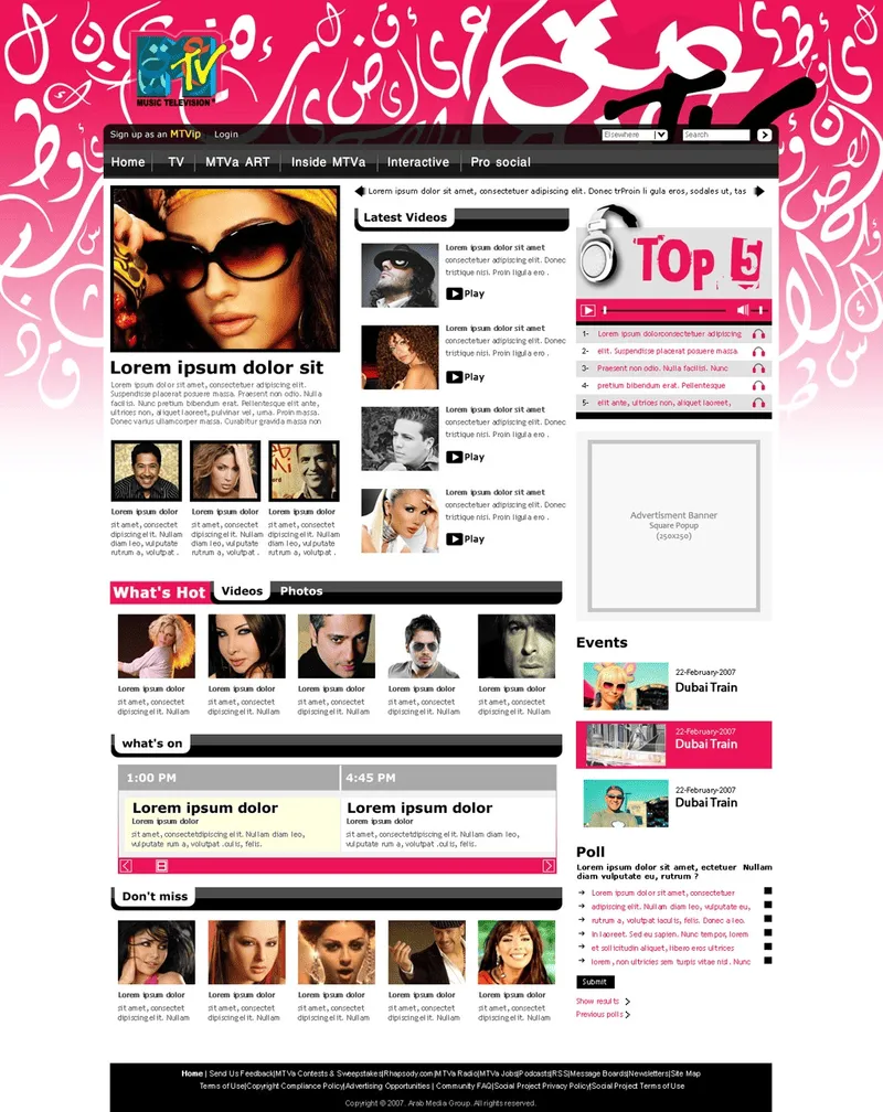
Modern early web aesthetics are a conscious stylistic choice rather than a technical constraint. Designers use historical limitations as expressive tools. The absence of heavy scripts, complex animations, and tracking tools builds instant trust. The site does not attempt to manipulate attention or hide its purpose.
Against the backdrop of digital noise, early web design offers an alternative vision. It recalls the internet as a space for creative freedom, experimentation, and personal expression where genuine connection matters more than engagement metrics.
Conclusion
Nostalgia in UI is neither a cheap trick nor a desperate step backward. It is a deliberate effort to re-examine past visual languages and bring back what years of relentless optimization stripped away: emotion, character, and a human touch.
Y2K, retrofuturism, brutalism, skeuomorphism, and early web aesthetics rely on different visual codes, but they share a core realization. Users care about how an interface feels just as much as how fast it works.
This trend is a natural reaction to sterile design. When every app looks identical, the products that dare to show personality win. Nostalgic styles allow brands to stand out, form genuine bonds, and tell stories instead of merely serving basic workflows.